

Crackers Daily (School project)
Crackers Daily
(School project)
Crackers Daily
(School project)
News App Design
Client
Crackers Daily
Role
UX Design Designer
Platform
Mobile App
Date
2022
Explore Design:
https://xd.adobe.com/view/fd7eff51-e987-4dc8-b942-acdbb4f11e89-a82d/screen/354efcc2-adfb-47a9-8271-a3d35f20b686/?fullscreen
Explore Design:
https://xd.adobe.com/view/fd7eff51-e987-4dc8-b942-acdbb4f11e89-a82d/screen/354efcc2-adfb-47a9-8271-a3d35f20b686/?fullscreen
Objective:
To provide users a public sphere where they can communicate and discuss different issues in a constructive approach to make their own conclusions on the issues. Create a marketplace of ideas where users can look into the various opinions of other users and understand views of other users coming from different backgrounds, to help users truly understand an issue in as much scope as possible.
Deliverables:
Competitive Analysis | User Research | Voice & Tone | Persona | User Journey | Wireframe | User Testing | Prototype
Deliverables:
Competitive Analysis | User Research | Voice & Tone | Persona | User Journey | Wireframe | User Testing | Prototype
Problem:
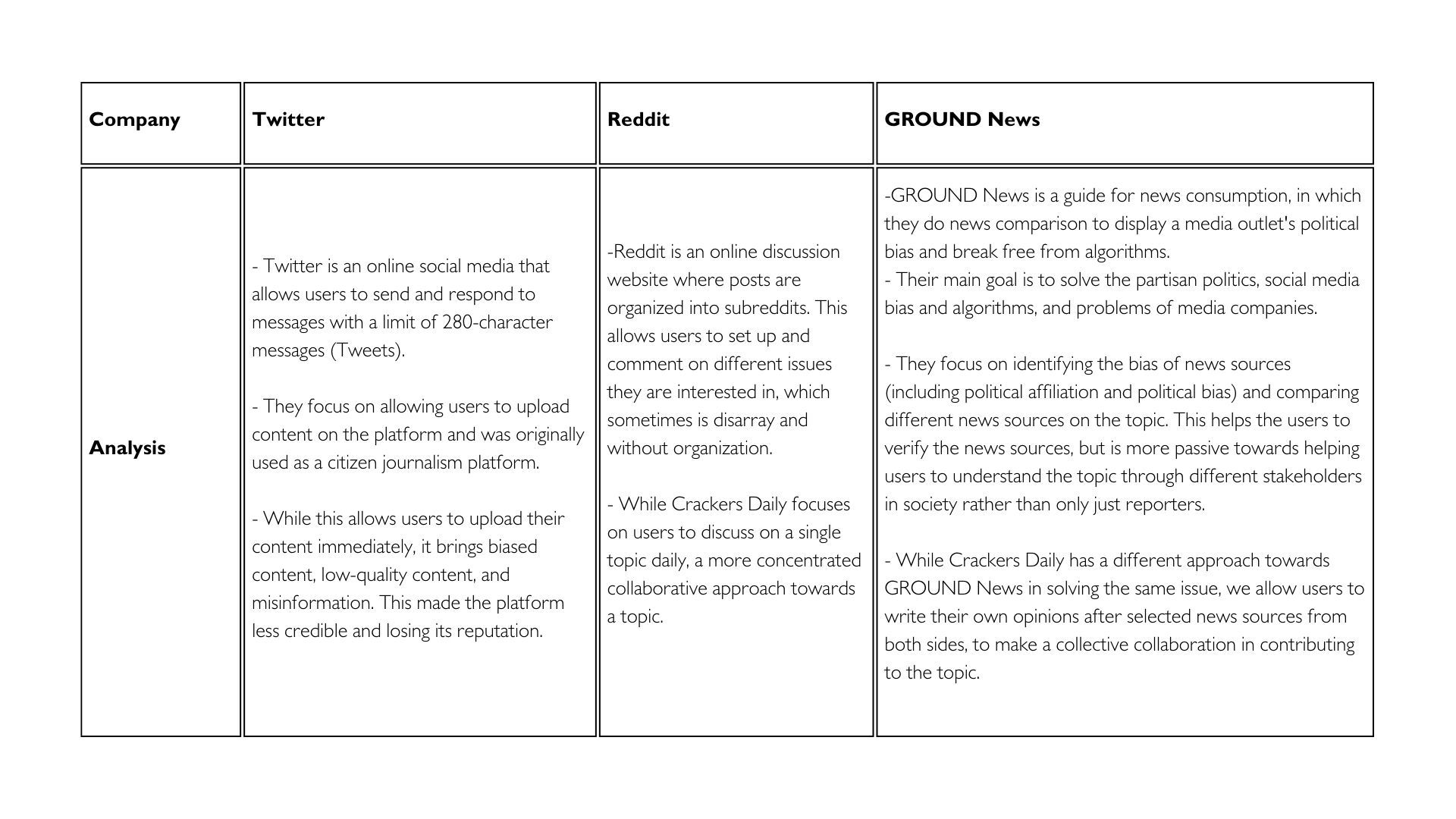
Currently social media platforms are losing users due to media bias and consequences of algorithms. Leading to users using the next generation of social media such as BeReal, MeWe, and Mastodon. They improve the user experience and privacy concerns in entertainment aspects, but do not provide a platform for political discussions.
Results
Letterkenny team was more than satisfied with the results and implemented multiple strategies
Reduced cart abandoned by 25%.
Results
Letterkenny team was more than satisfied with the results and implemented multiple strategies
Reduced cart abandoned by 25%.
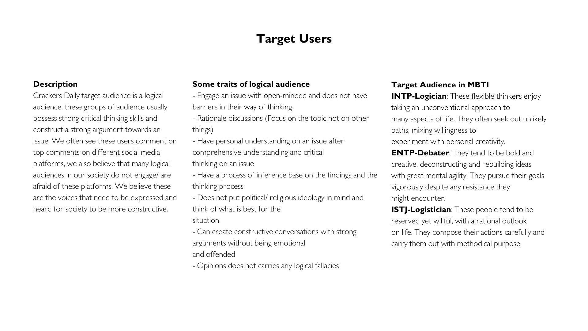
TARGET AUDIENCE
SOLUTION
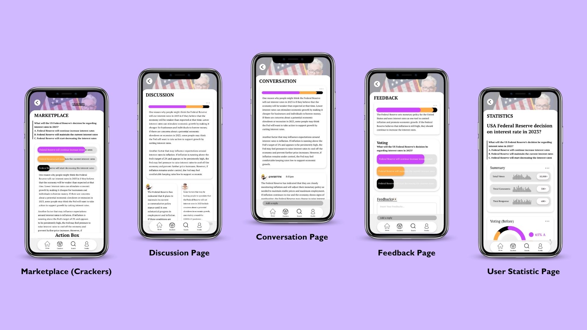
Crackers Daily is an anonymous platform for users to collectively discuss a topic daily. Users can use quadratic voting to vote and comment on their views. The display of the content will be using Pinterest or Tinder layout for more interactive experience for users.
SCREENS



RESEARCH INSIGHTS
SURVEY
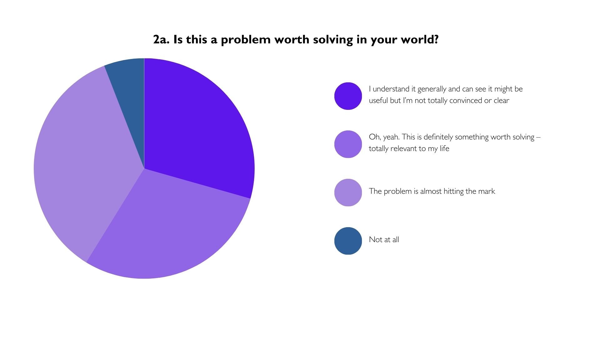
-64.7% Users think the problem is hitting the mark and worth solving-totally relevant to their life
-73.3% Users think that the project is unique and does not know something similar being proposed
-Keywords the users wants the experiences to be is simple, constructive, up-to-date, interesting, comprehensive
- Users suggest that the product should be user-friendly, easy to use, and anonymous for users from different backgrounds and the topics should be current issues. There could also be background or history for users to understand and create a welcoming environment for them to comment.
-Users respect the product because it is able to create a safe space for freedom of speech and users to speak up on their views. The product also shows potential to share and gather ideas and conversations, and spectrum is also a good tool to indicate peoples view on the issue.

COMPETITVE ANALYSIS
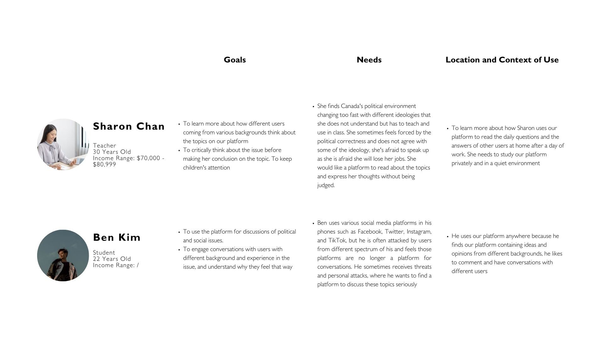
PERSONA
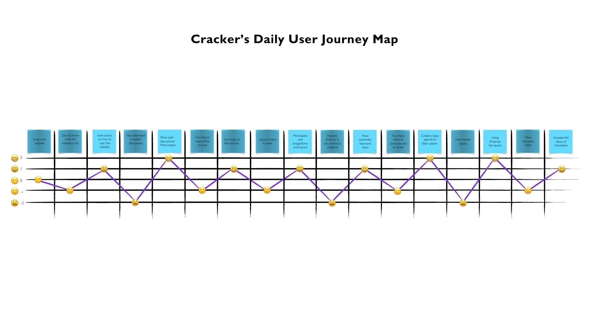
USER JOURNEY

DESIGN
VOICE AND TONE

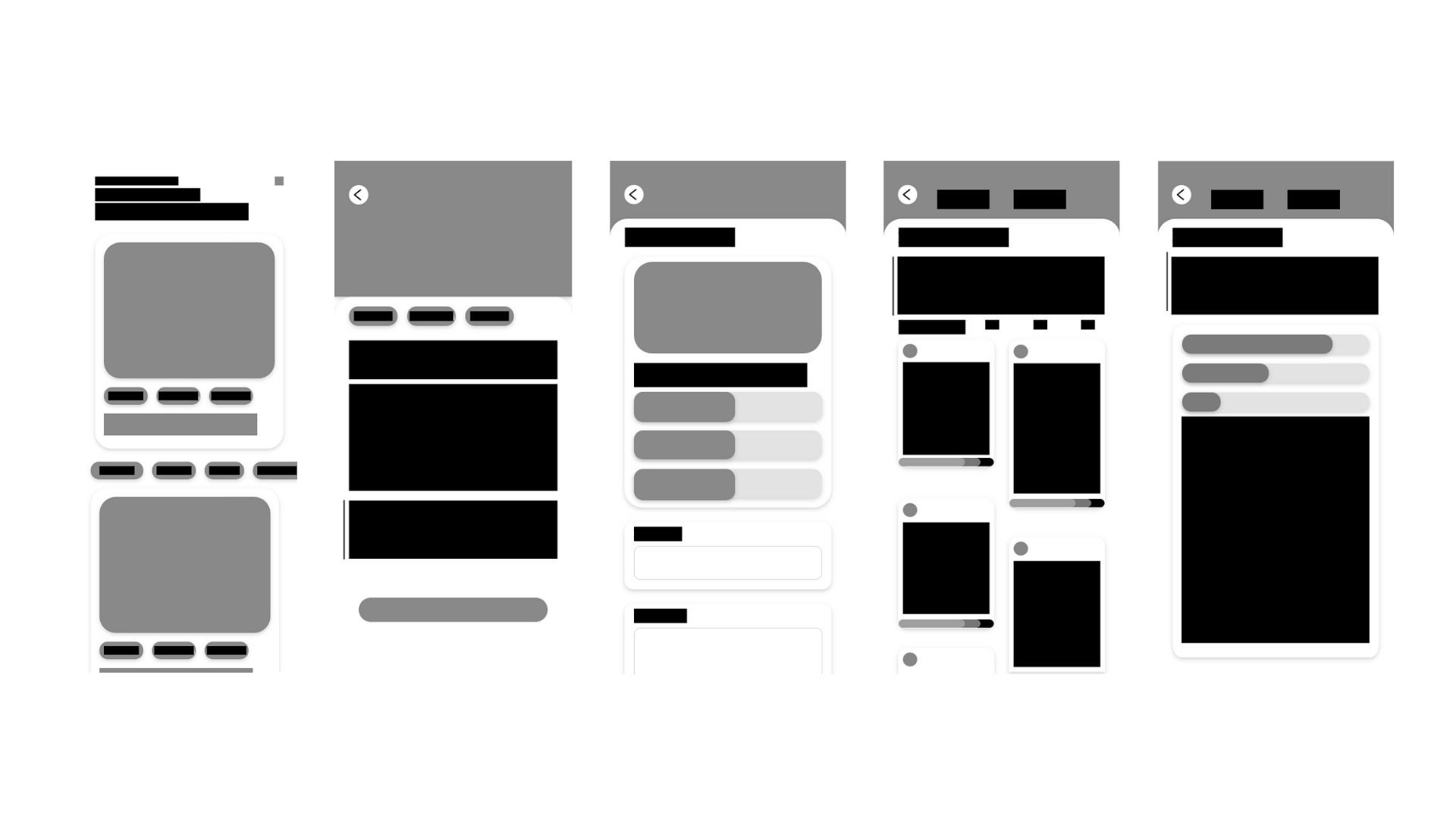
WIREFRAMING

USER TESTING
Testing Script
You see an interesting topic about the Federal Reserve’s interest rates decision and want to share your ideas/ start a conversation with others.
This is where you start the user journey of Crackers Daily!
After looking at the whole experience, please share your experience on this prototype?
How was the experience? Was the process smooth or confusing? How do you think I can improve it?
Do you think without instructions, you will be able to know where you are?
Are there any specific pages you think need changes/ are not consistent with the whole experience?
What do you think can improve the experience of this journey?
Any other suggestions/ comments on this prototype?
User Acceptance Criteria
User Story: As a user, I want to be able to look at the topic, comment on the topic, look at other comments, have conversations, and look at all the user’s feedback.
Scenario: Access Crackers Daily on an app after download
Given: The app is fully functional
When: The users perform different action on the app
And: Clicks into different buttons on the app
Then: The system is to be able to successfully connect the users to the action


What did I learn?
I learned that some of the prototypes do not really make sense to my users, as there was some confusion between my design and the users. Some of the misunderstandings were that many pages seemed too similar with just changes to the headings, I had to add some instructions and differentiate them to make it work better. I should not assume my users know what every function works and provide them with guidance.
TARGET AUDIENCE


SOLUTION
Crackers Daily is an anonymous platform for users to collectively discuss a topic daily. Users can use quadratic voting to vote and comment on their views. The display of the content will be using Pinterest or Tinder layout for more interactive experience for users.
SCREENS


RESEARCH INSIGHTS
SURVEY
-64.7% Users think the problem is hitting the mark and worth solving-totally relevant to their life
-73.3% Users think that the project is unique and does not know something similar being proposed
-Keywords the users wants the experiences to be is simple, constructive, up-to-date, interesting, comprehensive
- Users suggest that the product should be user-friendly, easy to use, and anonymous for users from different backgrounds and the topics should be current issues. There could also be background or history for users to understand and create a welcoming environment for them to comment.
-Users respect the product because it is able to create a safe space for freedom of speech and users to speak up on their views. The product also shows potential to share and gather ideas and conversations, and spectrum is also a good tool to indicate peoples view on the issue.


COMPETITVE ANALYSIS


PERSONA


USER JOURNEY


DESIGN
VOICE AND TONE


WIREFRAMING


USER TESTING
Testing Script
You see an interesting topic about the Federal Reserve’s interest rates decision and want to share your ideas/ start a conversation with others.
This is where you start the user journey of Crackers Daily!
After looking at the whole experience, please share your experience on this prototype?
How was the experience? Was the process smooth or confusing? How do you think I can improve it?
Do you think without instructions, you will be able to know where you are?
Are there any specific pages you think need changes/ are not consistent with the whole experience?
What do you think can improve the experience of this journey?
Any other suggestions/ comments on this prototype?
User Acceptance Criteria
User Story: As a user, I want to be able to look at the topic, comment on the topic, look at other comments, have conversations, and look at all the user’s feedback.
Scenario: Access Crackers Daily on an app after download
Given: The app is fully functional
When: The users perform different action on the app
And: Clicks into different buttons on the app
Then: The system is to be able to successfully connect the users to the action


What did I learn?
I learned that some of the prototypes do not really make sense to my users, as there was some confusion between my design and the users. Some of the misunderstandings were that many pages seemed too similar with just changes to the headings, I had to add some instructions and differentiate them to make it work better. I should not assume my users know what every function works and provide them with guidance.
