Letterkenny Case Study

TIMELINE
September - December 2022
TEAM
Devika Anupraj | Babak Jahedi | Damola Oladejo | Zoe Zheng | Wilson Fung
Tools
TOOLS
Adobe XD | Miro | Photoshop | Illustrator
PLATFORM
Mobile Website
Website: shop.letterkenny.tv
OVERVIEW
ABOUT
Letterkenny is a Canadian television series, about residents of Letterkenny belonging to one of three groups: Hicks, Skids, and Hockey Players, constantly feuding over seemingly trivial matters, often ending with someone getting their ass kicked. shop.letterkenny.tv is the official merchandise store for show lovers to purchase apparels and goods.
OBJECTIVE
Building a new design for Letterkenny ecommerce store for mobile experience according to the current website in XD, to create an immersive experience, reduce abandonment cart issues and build trust for the store. Providing content strategies and marketing strategies to tackle the above problems
PROBLEM
Letterkenny came to us in hopes to understand how they can improve sales from their mobile ecommerce website which is faced with the problem of abandoning carts and competition from 3rd party websites.
How might we improve the user experience for customers by improving the website from lack of authenticity due to the template-like design website?
DELIVERABLES
Current State Analysis | Competitive Analysis | Persona | Information Architecture & User Journey | Content Strategy | Style Guide | Wireframe | Prototype
GOALS
Reduce the issue of frequent abandoned carts
Increase website authenticity to prevent users buying from 3rd party websites
Give a Letterkenny experience for the users
SOLUTION


RESEARCH INSIGHTS
CURRENT STATE ANALYSIS


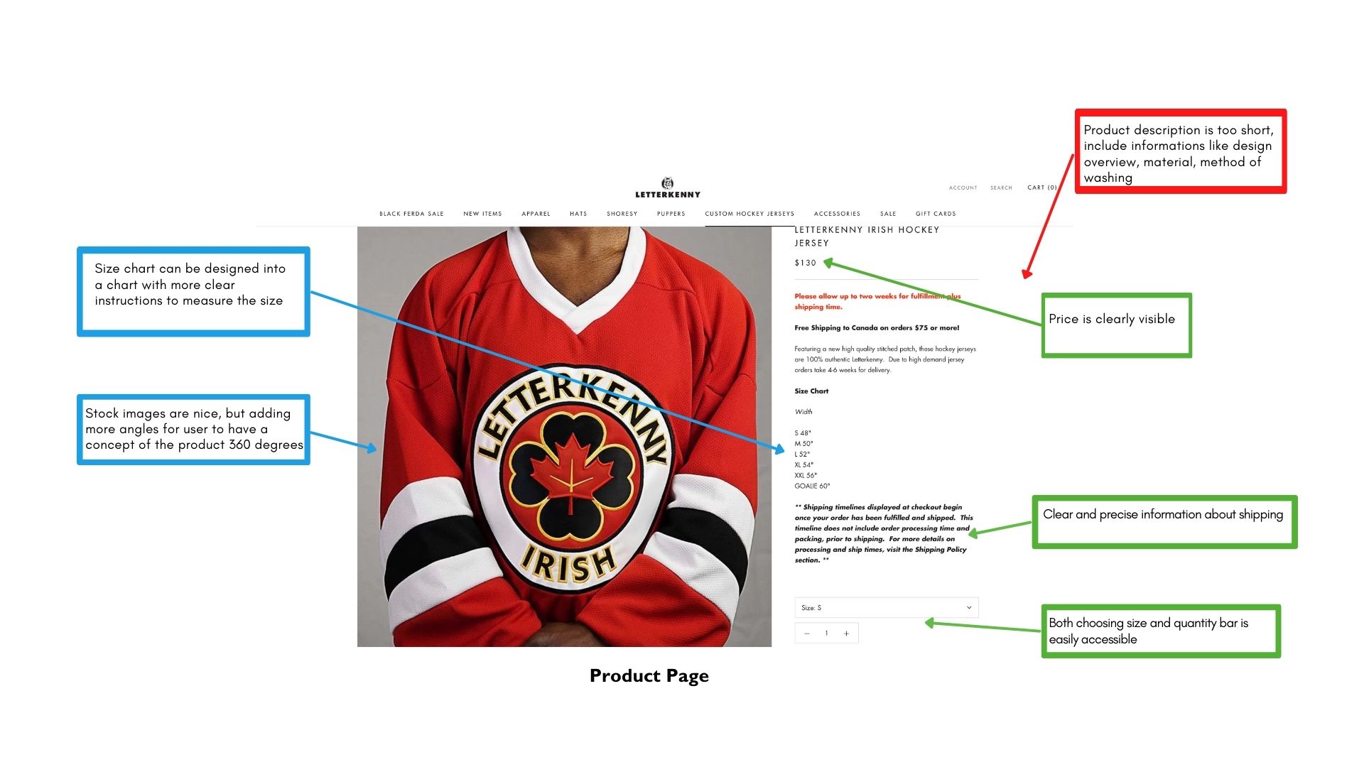

CONTENT AUDIT
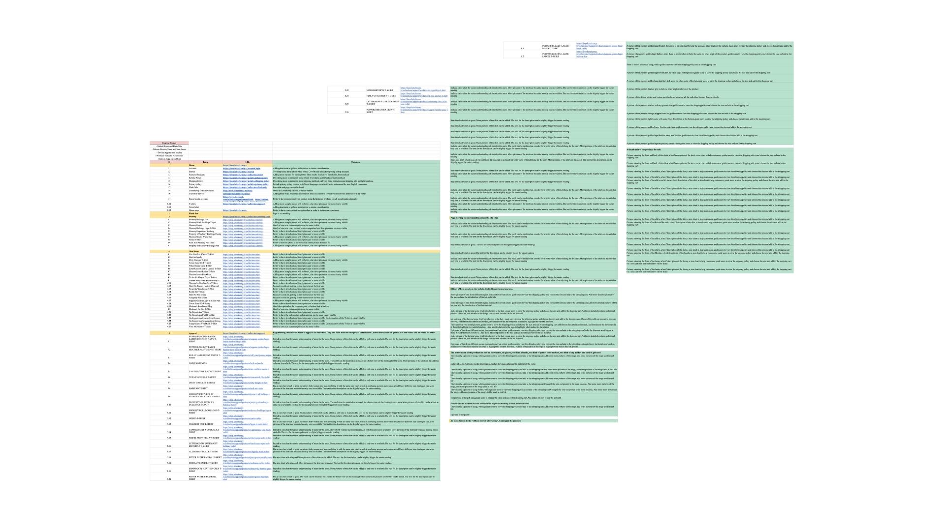
1. Consistency of primary navigation
2. Sold Out Products
3. Inconsistency in size chart
4. Description of Product
5. Add more sample photos
6. More information on shipping and return policy
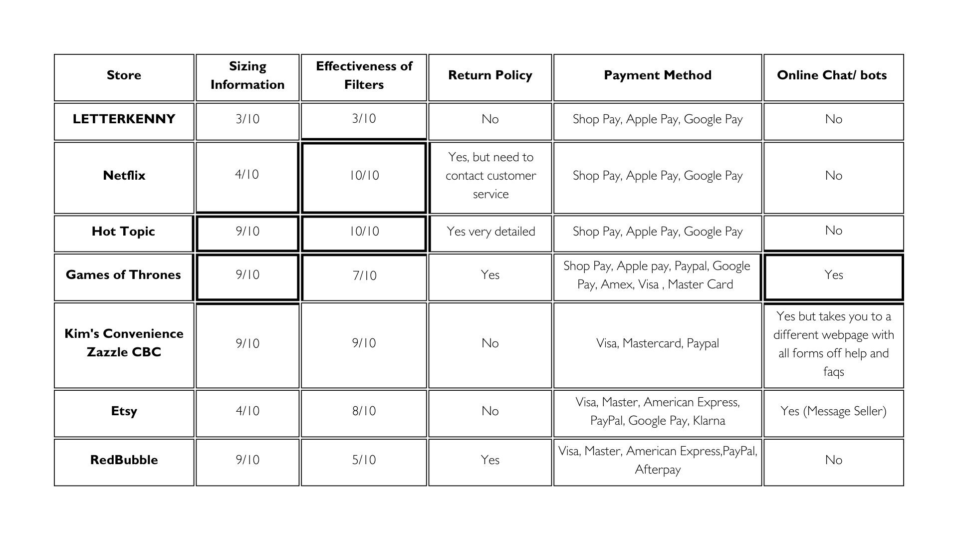
Competitive Analysis
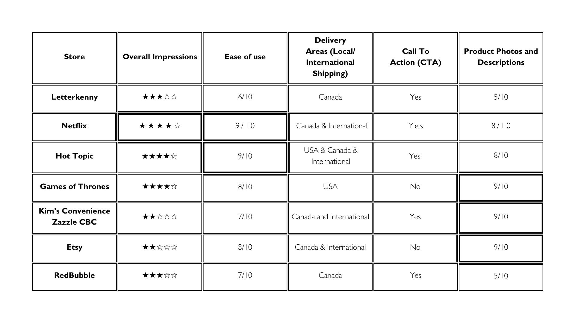
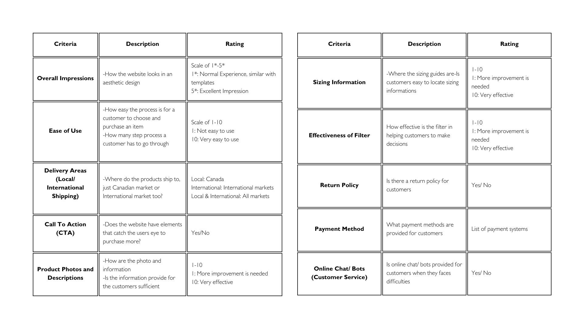
1. Overall Impression (Immersive Experience)
2. Ease of Use
3. Call To Action (CTA)
4. Product Photo and Descriptions
5. Sizing Information
CONTENT STRATEGY
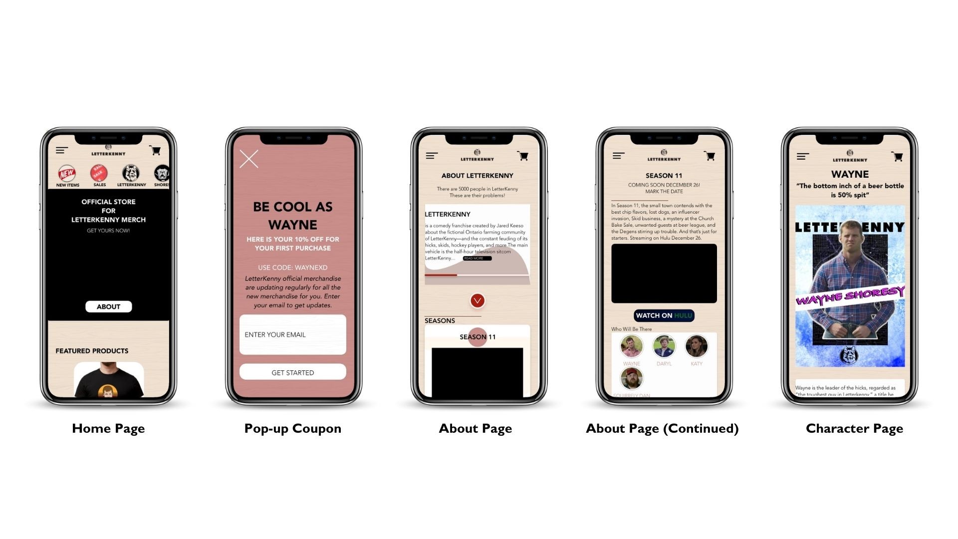
1. Call To Action buttons+Sticky Button (Abandoned Cart)
2. Set Up Exit-Intent Popups/ Interstitial (Abandoned Cart)
3. "About Us" Page (Increase Authenticity)
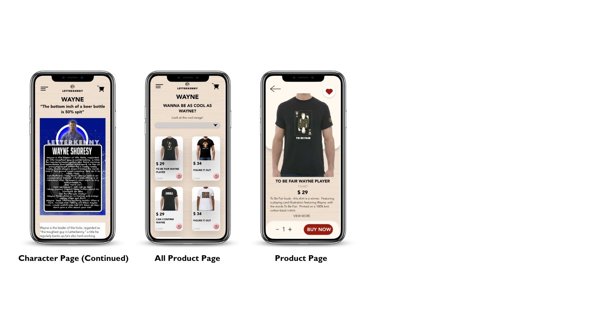
4."Letterkenny" Character Page (Increase Authenticity)
PERSONA

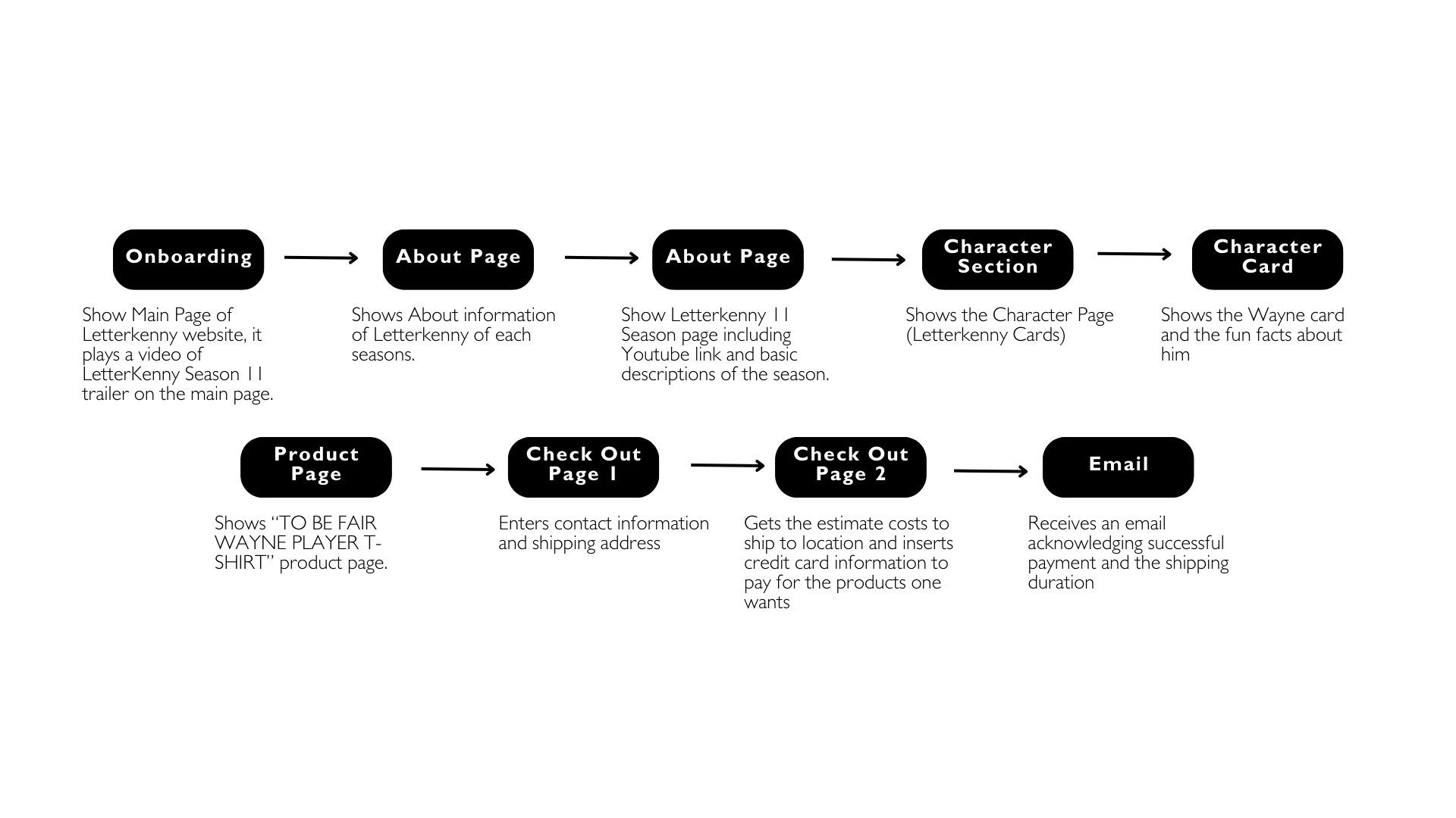
USER JOURNEY
UX THEME
The shopping experience currently does not provide an immersive online shopping experience similar to the Letterkenny show. Games of Thrones, in our competitive analysis, provide a good experience for view lovers; they use different elements in the show on their website to make it more interactive. Another website which is doing a good job is the Harry Potter website, the backgrounds, buttons, frames, and navigation bars provide the users with an experience inside the Harry Potter show. We want to create a similarly immersive experience for Letterkenny lovers by adding different Letterkenny elements, themes and little surprises on the page to amaze the website users.
DESIGN
STYLE GUIDE

SITEMAP

NEXT STEPS/ RECOMMENDATIONS
1.Main Character Videos (Increase Authenticity)
2. Ask Actors and Actress to model (Increase Authenticity)
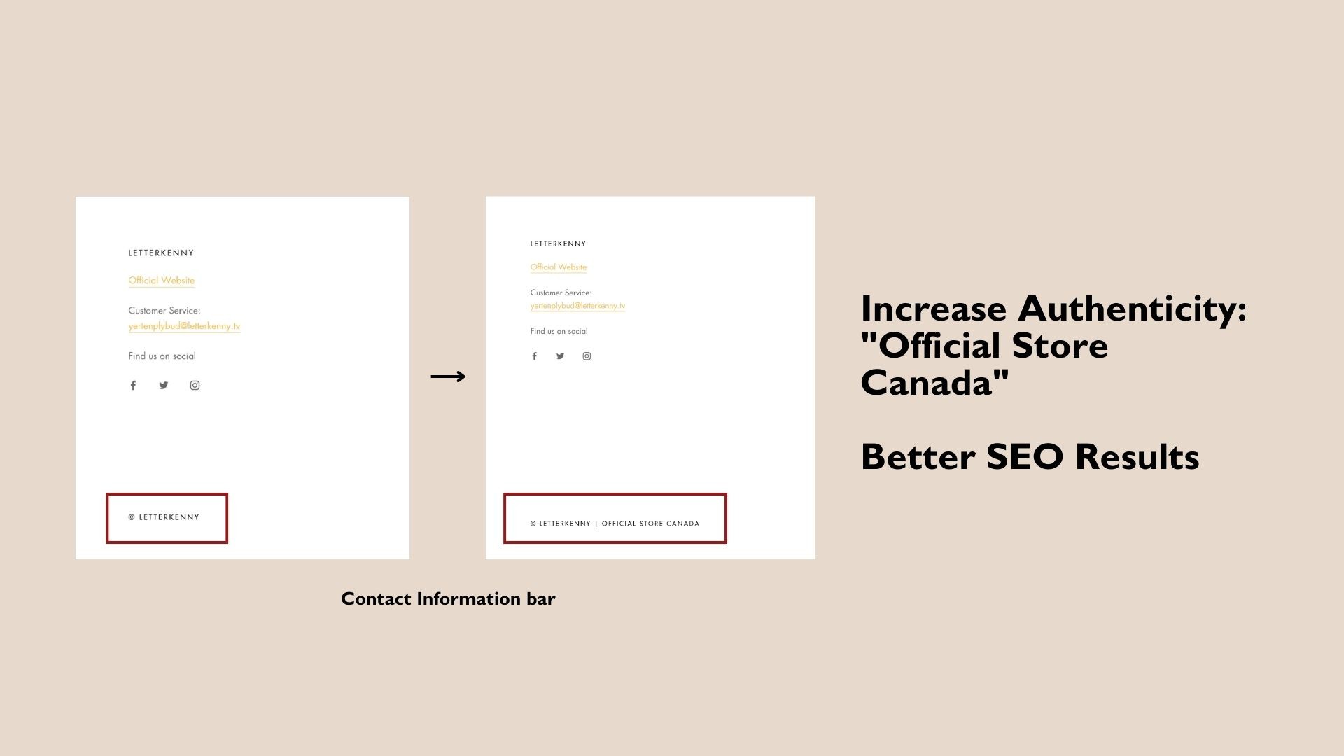
3. Better SEO results (Marketing Strategy)
4. Instagram Page and Shop (Marketing Strategy)
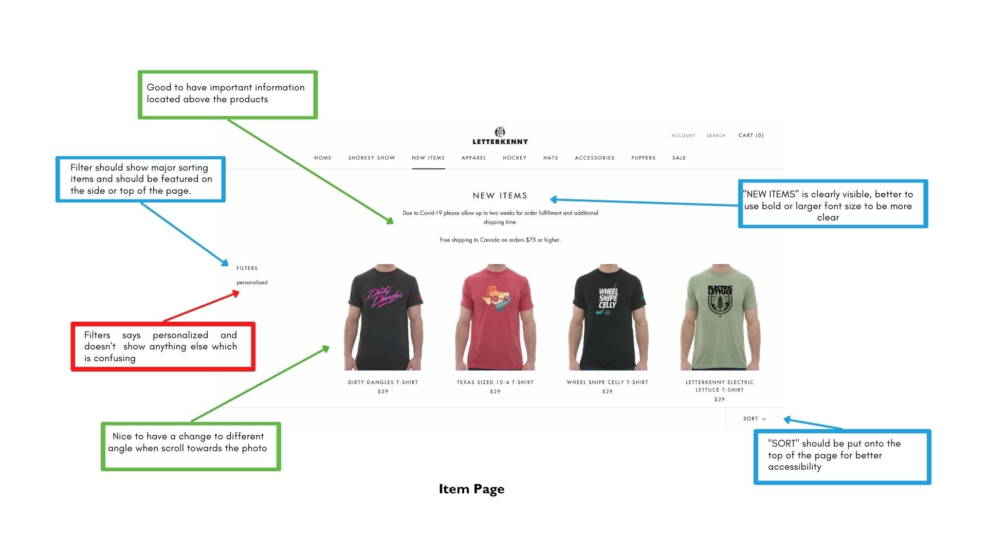
5. Add more to the "Sort by" system (User Experience)
6. Games and Trivia (Increase Authenticity)
7. Use Trustpilot (Increase Authenticity)
NEXT STEPS/ RECOMMENDATIONS


Letterkenny Case Study
TIMELINE
September - December 2022
TEAM
Devika Anupraj | Babak Jahedi | Damola Oladejo | Zoe Zheng | Wilson Fung
TOOLS
Adobe XD | Miro | Photoshop | Illustrator
PLATFORM
Mobile Website

Website: shop.letterkenny.tv
OVERVIEW
ABOUT
Letterkenny is a Canadian television series, about residents of Letterkenny belonging to one of three groups: Hicks, Skids, and Hockey Players, constantly feuding over seemingly trivial matters, often ending with someone getting their ass kicked. shop.letterkenny.tv is the official merchandise store for show lovers to purchase apparels and goods.
OBJECTIVE
Building a new design for Letterkenny ecommerce store for mobile experience according to the current website in XD, to create an immersive experience, reduce abandonment cart issues and build trust for the store. Providing content strategies and marketing strategies to tackle the above problems
PROBLEM
Letterkenny came to us in hopes to understand how they can improve sales from their mobile ecommerce website which is faced with the problem of abandoning carts and competition from 3rd party websites.
How might we improve the user experience for customers by improving the website from lack of authenticity due to the template-like design website?
DELIVERABLES
Current State Analysis | Competitive Analysis | Persona | Information Architecture & User Journey | Content Strategy | Style Guide | Wireframe | Prototype
GOALS
Reduce the issue of frequent abandoned carts
Increase website authenticity to prevent users buying from 3rd party websites
Give a Letterkenny experience for the users
SOLUTION


RESEARCH INSIGHTS
CURRENT STATE ANALYSIS


CONTENT AUDIT


1. Consistency of primary navigation
2. Sold Out Products
3. Inconsistency in size chart
4. Description of Product
5. Add more sample photos
6. More information on shipping and return policy
Competitive Analysis


1. Overall Impression (Immersive Experience)
2. Ease of Use
3. Call To Action (CTA)
4. Product Photo and Descriptions
5. Sizing Information
CONTENT STRATEGY
1. Call To Action buttons+Sticky Button (Abandoned Cart)
2. Set Up Exit-Intent Popups/ Interstitial (Abandoned Cart)
3. "About Us" Page (Increase Authenticity)
4."Letterkenny" Character Page (Increase Authenticity)
PERSONA


USER JOURNEY


UX THEME
The shopping experience currently does not provide an immersive online shopping experience similar to the Letterkenny show. Games of Thrones, in our competitive analysis, provide a good experience for view lovers; they use different elements in the show on their website to make it more interactive. Another website which is doing a good job is the Harry Potter website, the backgrounds, buttons, frames, and navigation bars provide the users with an experience inside the Harry Potter show. We want to create a similarly immersive experience for Letterkenny lovers by adding different Letterkenny elements, themes and little surprises on the page to amaze the website users.
DESIGN
STYLE GUIDE


SITEMAP


NEXT STEPS/ RECOMMENDATIONS
1.Main Character Videos (Increase Authenticity)
2. Ask Actors and Actress to model (Increase Authenticity)
3. Better SEO results (Marketing Strategy)
4. Instagram Page and Shop (Marketing Strategy)
5. Add more to the "Sort by" system (User Experience)
6. Games and Trivia (Increase Authenticity)
7. Use Trustpilot (Increase Authenticity)
NEXT STEPS/ RECOMMENDATIONS
